Bidlogix Limited
Leveraging UX principles to design a winning landing page for online auction software for global reach.

Project Type
Landing Page Design & Translation Application
Role
CRO Designer, Gartner
Tools
Instapage, Figma, Illustrator, Photoshop
Challenge
Bidlogix, a UK-based software company specializing in online auction applications, began their journey with Gartner and needed a landing page that would unlock a worldwide audience for their product, BidJS.
Solution
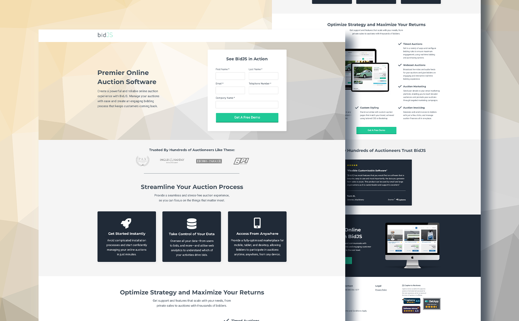
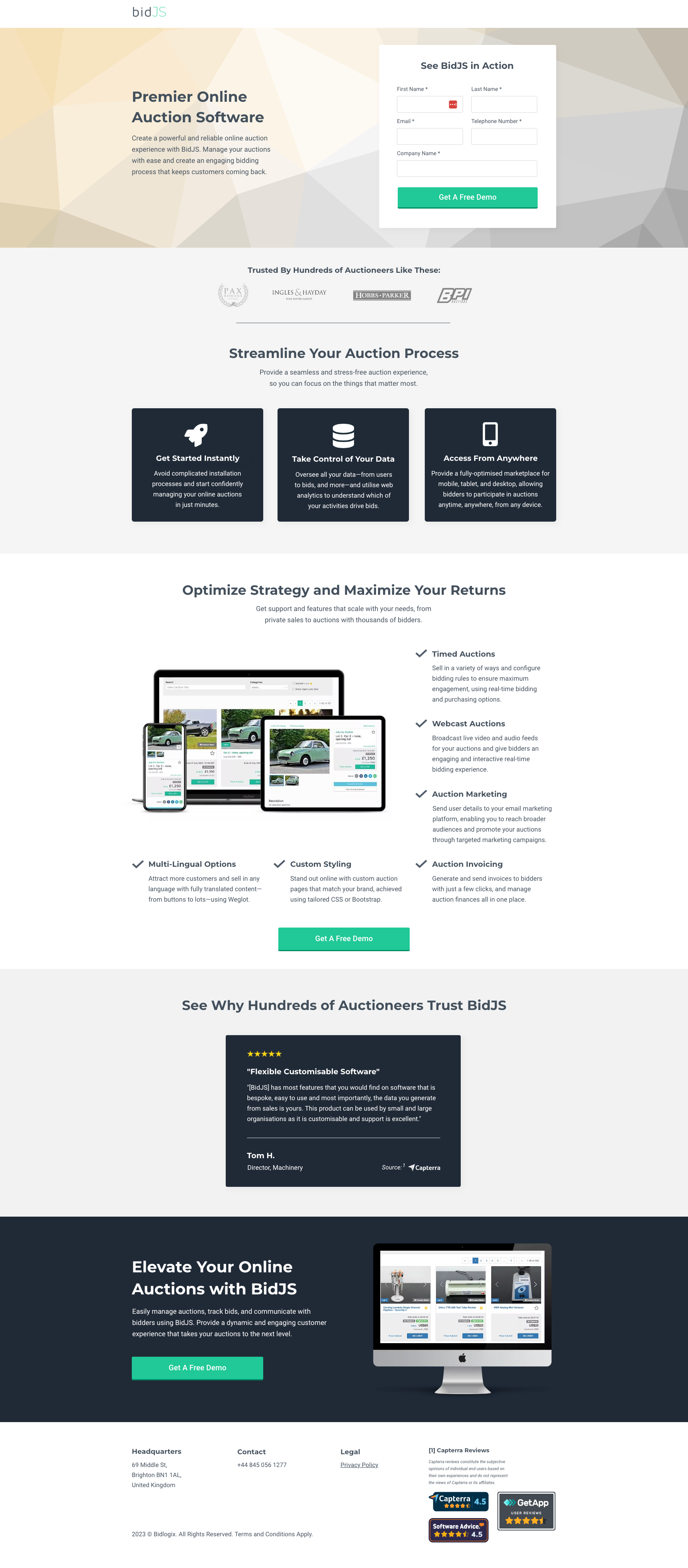
To boost their visibility, I researched well-performing pages in the Auction, Fundraising, and eCommerce categories, using a combination of metrics from the US, UK, and Europe. Based on those findings, I streamlined their existing product content, ensuring a clear and concise value proposition resonated across all audiences, regardless of language. Adhering to best practices and the client's brand identity, I created a simple, yet effective solution for their pay-per-click campaign.
Category Analysis & Design
There weren't many similar solutions to the client's to compare to, so I identified common trends in the layout, style of copy, and other design elements which drove conversions in adjacent categories such as fundraising and ecommerce.
KEY TRENDS Identified
- Short & Sweet: A streamlined page, with information presented clearly and succinctly, historically led to a greater number of conversions.
- Immediate Action: Heat maps in these categories indicated users typically view the first half of a page before deciding to convert, so placing the form above-the-fold, with trust elements and value-add readily available, was key.
- Bold, Simple Visuals: Only 1-2 images were featured throughout successful pages, and most of the elements guiding the user journey made a statement through their simplicity.
Design
With key areas to highlight identified, and adhering to best practices, I created a wireframe to establish the basic page layout — one that would be clean and concise, in alignment with Bidlogix's branding.
While information about the BidJS software was spread out over 2 sites, I referenced the product-specific site, per the point of contact's request, for a cohesive brand identity. The only color they were using, aside from a dark grey, was a vibrant green-blue hue. Instead of introducing a different color for the CTA, I leaned into the brand green and opted for almost no color elsewhere on the page.
I also applied a button hover effect to mimic the existing styling on their website, in order to keep the customer journey consistent. The images were obtained from the main Bidlogix website, as well as extra product data, and all writing kept the informative, professional tone of voice as used by the company.
One element I needed to consider was ensuring the copy could be as impactful and accessible across 6 other languages.
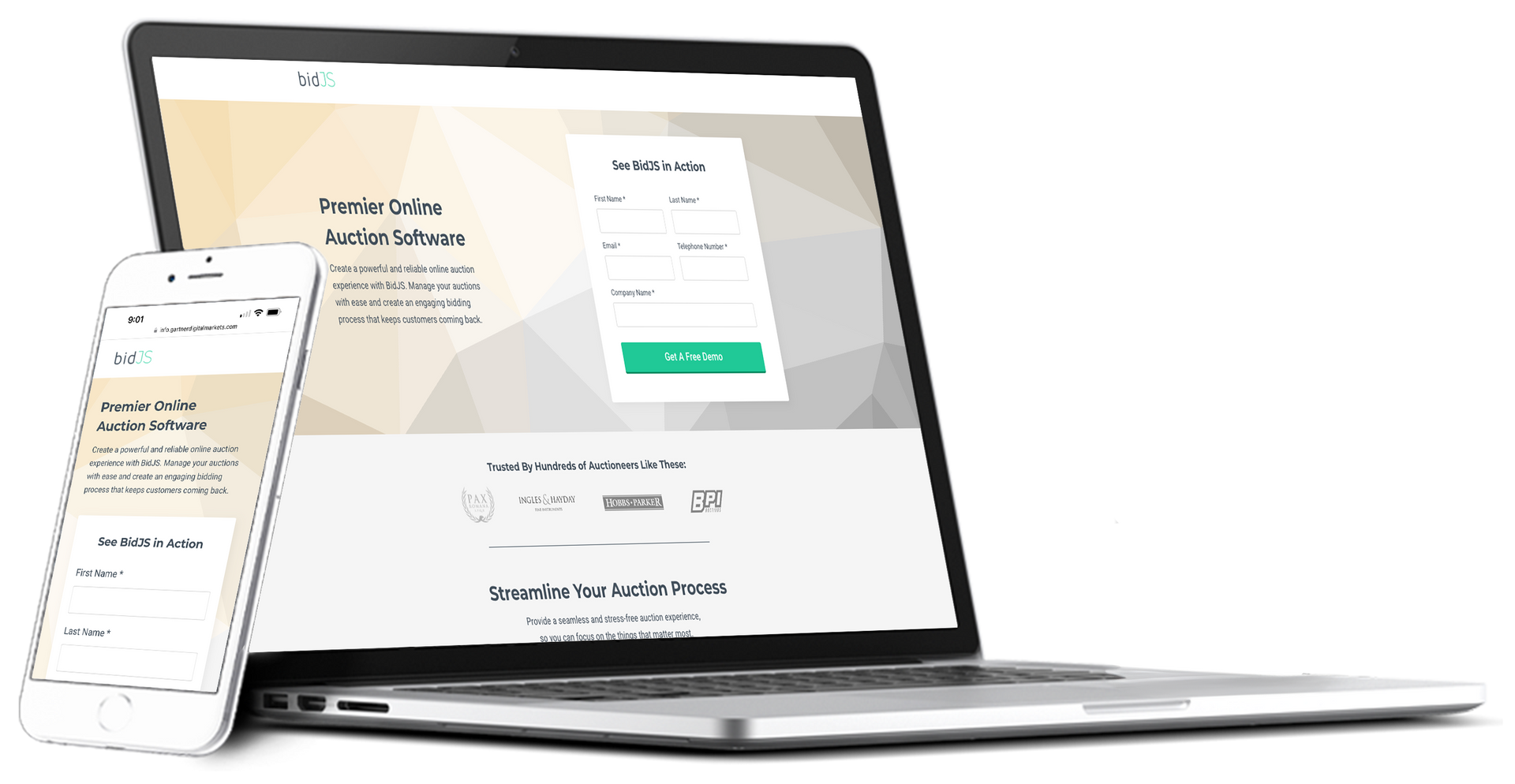
The page underwent an internal design and stakeholder review to gather feedback and finalize the design. Once complete, I reviewed the page with the point of contact at Bidlogix, received approval for the desktop and mobile sites to go live, and began the process of obtaining translations for the page from our internal agency.

Around the World: Expanding Reach
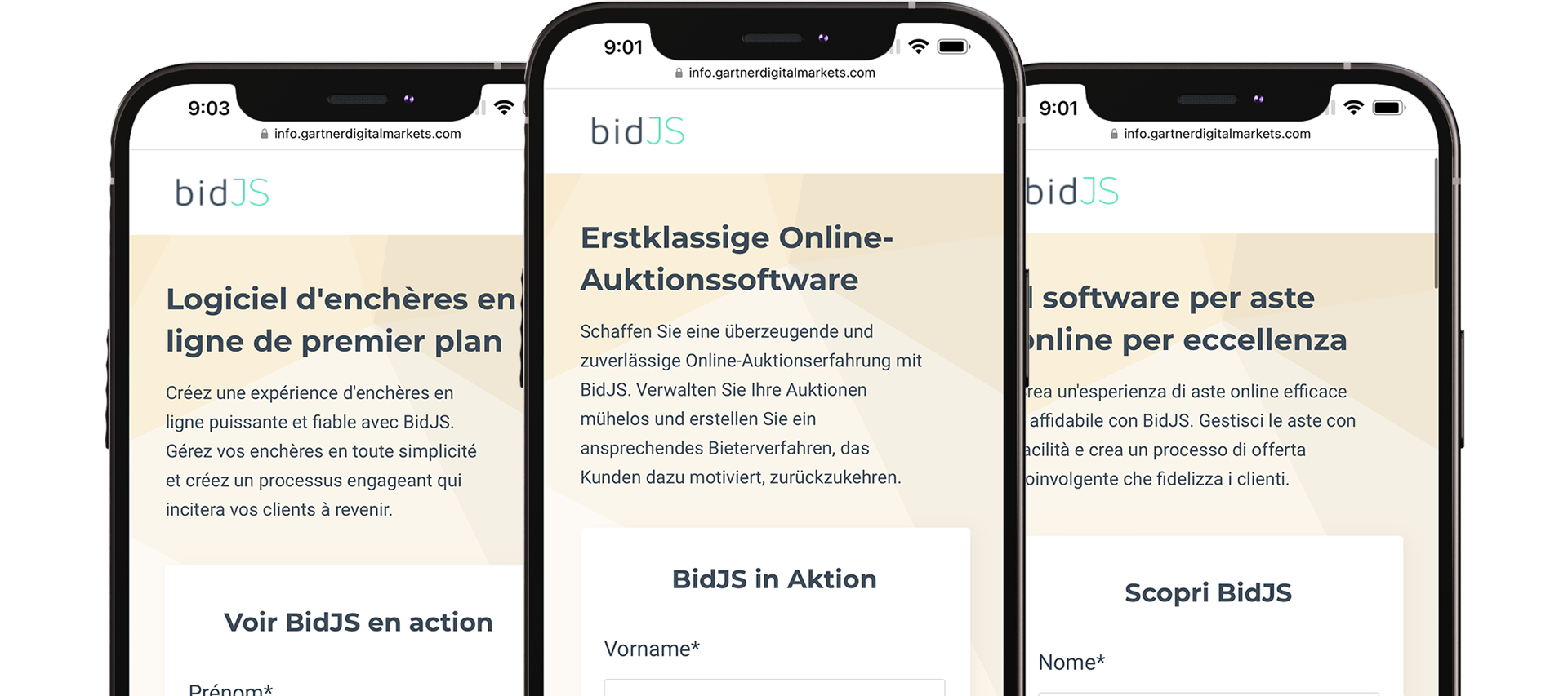
While English is spoken by approximately 20% of the world's population, we found that global buyers tend to show more interest in our clients' software — and are 2x as likely to convert — if the landing pages were available in their first language.
As Bidlogix's campaign was targeting multiple countries with different native languages, we set out to appeal to as many buyers as possible. The landing page was translated into Spanish, French, German, Dutch, Italian, and Portuguese.
Benefits
- Global Growth Engine: Unlock hidden markets and boost sales by reaching customers in their native languages, expanding your reach exponentially.
- Happy Customers: Deliver seamless, native-language experiences that delight customers, boosting engagement and building lasting loyalty.
- Trust & Advocacy Champions: Establish credibility and marketability, turning happy customers into brand advocates who drive organic growth.

